What's difficult parsing resumes – Part II: Visual cues only apparent to a human
Exploring how visual design elements in resumes can make automated parsing challenging.
What's difficult parsing resumes – Part II: Visual cues only apparent to a human
Posts in this series:
- Part I: Converting PDFs into readable text
- Part II: Visual cues only apparent to a human
In the previous post of this series we talked about the challenges of converting a PDF into a sensible text representation, so it can be analyzed and parsed into structured data.
This post expands on the same topic.
There are countless CV designs where a human is without any thought able to tell which text nodes relate to each other and which don't, and at the same time in those design a computer will struggle a lot.
In this post we go through some examples:
- Text nodes very far apart
- Decorative graphics between text nodes
- Icons instead of labels
- Skill levels as progress bars
Let's get going...
Text nodes very far apart
This is the most common pitfall when writing an algorithm to combine related text nodes.
In many column layouts there can be text nodes that are really close to each other and vertically adjacent, but still they belong to different columns of text. And text nodes inside those columns can even be farther away from each other from each other, than the edge nodes to adjacent columns.
Especially if the column text is justified, which can create a lot of space between words.

Example of two columns of justified text, where the space between individual words is much larger inside a paragraph than between the paragraphs themselves. Vertically the text lines are aligned which makes it even less apparent for a computer that there are columns here.
This is super easy for a human to interpret. But not necessarily for a computer.
This is why it makes sense to consider taking into account not only the text node dimensions, but also its color and font style. They can act as hints in these kinds of cases.
Yet, you can't rely on it 100%; text lines may contain links or other pieces of text which are colored differently from the rest of the paragraph, so if you rely on similar color without hesitation, you'll end up with broken paragraphs.
Decorative graphics between text nodes
You may be intrigued to analyze other than text nodes in the document to figure out which text nodes are part of the same paragraph.
For example, if there's an image in-between two text nodes, surely that's a sign they can't be part of the same text block! Right?
Unfortunately, no. Many CVs contain visual elements which cannot be interpreted in this way. Here's a particular example:
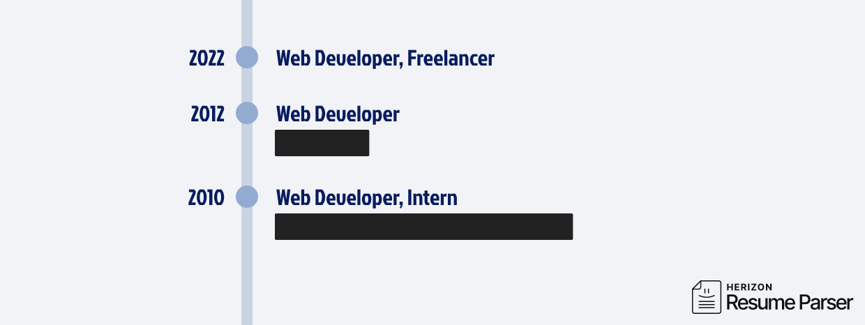
Example of a PDF with a decorative line between related text nodes. Sometimes the decorative element can be more complicated.
How easy it is for a human to understand that the year numbers are related to the text on the right of them! But how could an algorithm know? In the eyes of a computer the graphical element could be a visual border separating two columns of completely unrelated text.
In our experience it's better to rely simply on text nodes than including graphics elements in the algorithm, because there really is no way for the algorithm to know in this case whether to interpret the graphical element as a divider or not.
Icons instead of labels
Although more rare than you might expect, it still happens that people use graphical icons instead of labels to… label their CV contents.
A common example is links to social network profiles. They'll often have a Twitter/X icon or a LinkedIn icon next to the link. Luckily in these cases the text usually is or contains the link itself, so you don't have to guess. (Sometimes you do, though!)

Example of icons to distinguish between social media platforms.
Then there's other kinds of icons that can be used. It is only limited by the imagination of the CV layout designer.
Trivial for a human to understand! But a computer algorithm needs to use computer vision to interpret these.
Skill levels as progress bars
Many people visualize their skills in the form of a progress bar:

Example of using progress bars to visualize skill levels.
Similar structure can be present in different formats. For example, here language levels are visualized using coloured dots from 1 to 5:
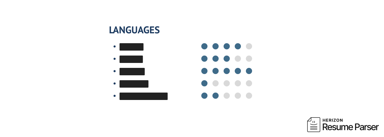
Example of visualizing language skills with coloured dots.
Just like above, this is again extremely difficult for an alogorithm to understand. As illustrated in our previous post and in the previous sections of this post (e.g. decorative elements between text), it's usually best to discard graphics. But in this case you can't, if you want to accurately parse the skill levels.
It's worth noting that using this kind of progress bar for skill levels is not a good practise. What does "2/5" mean exactly? Or "Front-end development – 60%" In any case, people use this pattern and your parser must take it into account.
Want to try our parser?
Get in touch to learn how we can help with your resume parsing needs.
Contact us